
We have all been there as makers. We made a unique, innovative, creative product(s) and it’s not selling at markets. In the moment, it can be incredibly discouraging and potentially an expensive loss if you choose to pull the product(s) you’ve spent so much time, money, and energy creating. Instead of doing that, let’s look at ways we can improve our visual presentation to attract the right person for our handmade product(s).
1. Repetition
When creating a shoppable space, repetition is key. We want our shopper to see the product, want the product and buy the product.
Repetition can be achieved in numbers:
Working in groups of 3, 5, or 7 (odd numbers) instead of 2, 4, or 6 (even numbers) will be more visually appealing. This can be done in rows or groups or by the individual item.
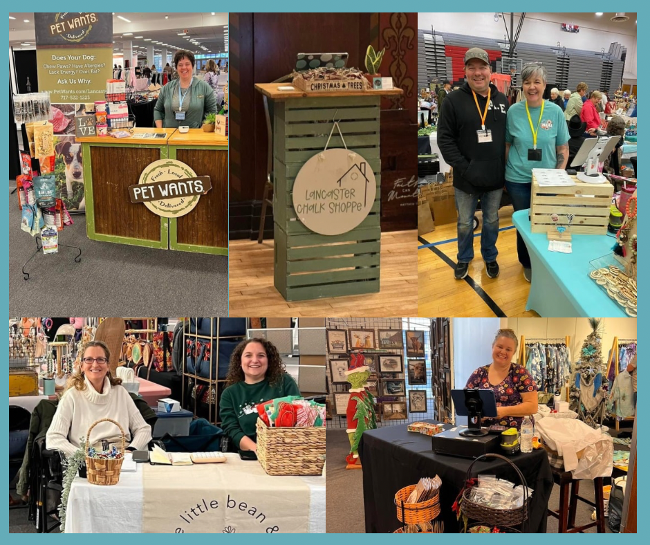
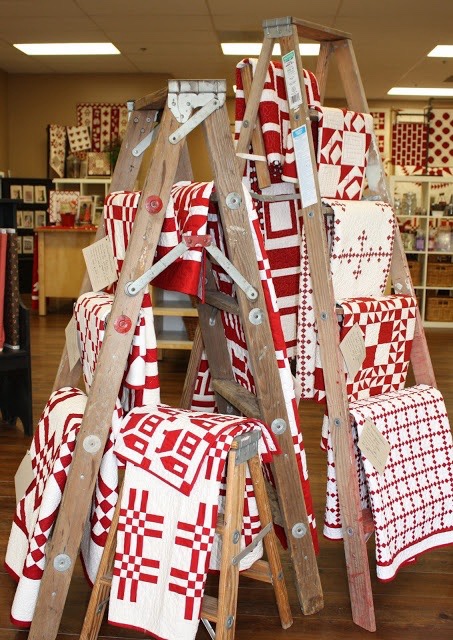
Repetition can be done by item:
Example: all body butters together, all 16 oz candles together, all stud earrings together
Below is a great example of repetition done by item:

2. Accessibility
It is hard for many people to ask for assistance especially when in public settings. There are two important parts when determining how accessible your products and your process are to purchase.
Accessibility of Product
Can your shoppers easily take your product out of the display it is in? Or will they potentially knock neighboring products over?
Is your product on a riser or varied height to allow your shopper to see and select options? Or are products flat on the table where the products towards the back of table may not be in arms reach?
Accessibility of Process
Can your shopper clearly see where they need to check out? Or are you just available when they are? They are not mind readers (me neither!). If they don’t know where to go to check out then they potentially will not. Make a check out sign to sit in front of your check out area or station to allow each shopper a clear view of what’s next.
Can your shopper easily walk/roll to your designated area? Or are you tucked in a corner behind product because you ran out of room? If it’s awkward for you to reach over product when handling a transaction, it is awkward for them too.
And truthfully, if a shopper has already taken the time to walk through your store, they are ready to go when they are ready to go. Having too much product in front of your check out area that someone else may be seeing for the first time is going to elongate your initial shopper’s time that they need to be in your booth.
Have you ever waited too long to check out somewhere? Have you ever put items down because you have already exhausted the time you knew you had? Me, too. Keep the process streamlined so they can stay on their own timeline.
Here are a few great examples of check out areas you can try:
3. Lines & Composition
We need to guide our shopper, hold their hand if you will, to see all of the incredible and creative products we have made.
Below is a photo of a display set up. Take a look at it and see what you notice first, second, third, etc.:
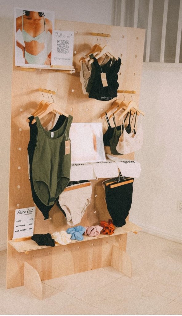
Is this how your eyes followed their display?:
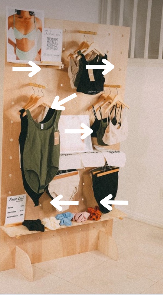
If you answered yes (or very close to it), it is because the maker is following the lines and composition of the space. The set up is walking them through each spot on the display from the photo of someone like them in the product, walking them through the options to create the pictured look, letting them organically fall in love with the quality and texture of the products and eventually showing the price for the product they have now experienced.
The visual tools this maker used to achieve this are:
1. The height of the signage grabs attention at the top
2. The slightly lower and offset first product gives a path for the eye to follow
3. The middle of the display in a straight line encourages the eye to read left to right
4. The final signage demonstrates that this walk together has been completed
Together, these tools allowed the maker to guide the shopper through their products with a positive and clear experience.
4. Color
This definitely has to be one of the most visually impactful ways we can make our space catch the eye of potential shoppers.
How does RED make you feel? BLACK? YELLOW? WHITE? BLUE?
Now how does it make you feel if you had all of those colors EVERYWHERE? Likely a little uneasy and overstimulated if we had to guess.
Color blocking gives visual purpose and definition to a store and brand. It sets the tone. It creates a palate.
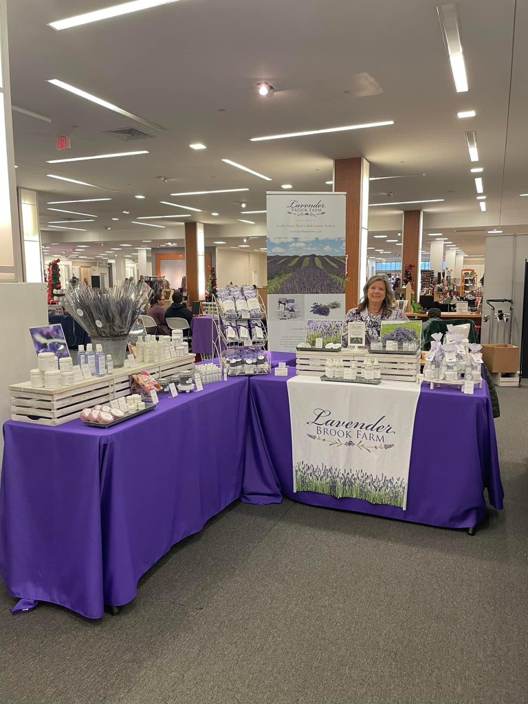
Easy/Small ways to color block
Do you use crates in your display? Are they all the same wood tone? Some stained or painted? Some not?
What about your table clothes? Do they match? Or are they randomly selected?
Making a conscious and intentional choice about keeping colors the same in your display gives unity to your space.
Here is an example of using the same color tones to create a cohesive color block effect prior to setting up product:

Next is an example of coloring blocking with product included:
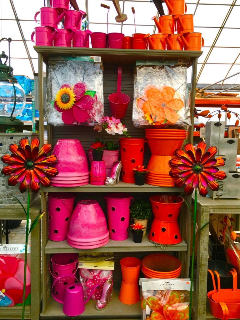
Bigger ways to color block
Do you have products that are all white? Or maybe all a specific print?
Separating items by color gives a GREAT impact and strongly catches the eye of a shopper.
Again, making a conscious and intentional choice about keeping colors the same in your display gives unity to your space.
Below are examples of a BIG impact of color (and prints):
At the end of the day (end of market, rather) we of course want to make out financially when vending. We need to cover our booth fees, all of our supplies, gas to/from, our time, and much more. Part of vending at any market is taking the risk and opportunity of putting ourselves out there as makers, creators, and artists. One weekend you could have your absolute more profitable market while others are much less profitable.
Setting up our booths at a market one specific way will never be exactly what brings you a SOLD OUT sign from The Shank Shoppe team. But trying a few tricks that others have seen success with, just might be what you needed to get the beautiful, unique, one of a kind item you created into the hands of someone who loves it!
We can’t wait to see what you create next!

Thanks for this! It is so hard to create a great display on a budget. I have a question for you about color blocking. I have crates that are stained the same color. I just decided to add a new display piece–it is a wooden castle. It can display 16 of my felted critters. My original thought was to do it up like a dollhouse–create a stone look on the outside and design each “room” differently. I’m wondering though, is simple better? Should I just stain it the same color as the crates for consistency?
Sherri
Whiskers and String
LikeLike